A good logo design forms a lasting impression in the customer’s mind. It is representative of the company’s identity in the market. However, it isn’t an easy task to get a well designed logo. There are numerous professional techniques for logo designing. You can notice the incorporation of such professional tactics in the best logo design samples. This article provides a list of top 15 logo designs by an advertising agency.
Uni Square Concepts is a Delhi based advertising agency. We offer advertising and marketing related services. Our aim is to serve clients in a professional and creative way. Following is a list of effective and amazing logo designs by our top design company.
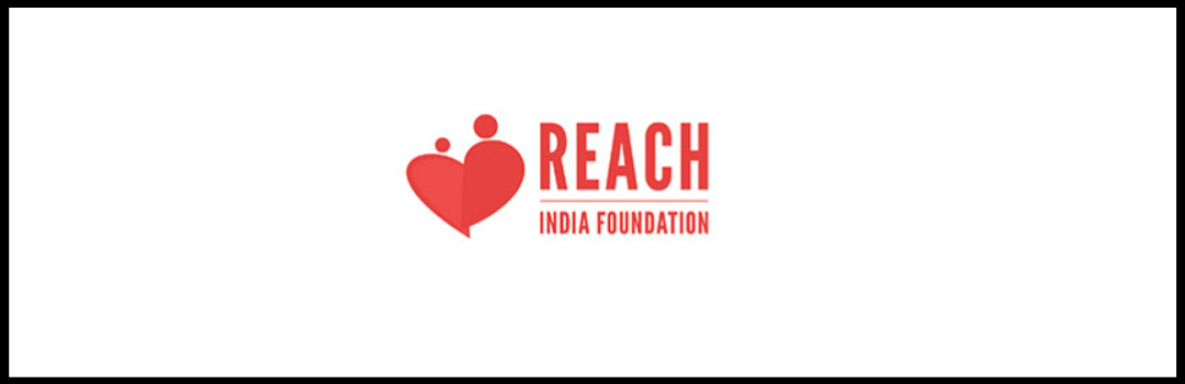
1. REACH India Foundation | Industry: Non-Profit Organization
This is a well designed logo, simplistically conveying the organization’s purpose. Reach India Foundation is an NGO, functioning with an aim to uplift the underprivileged section of the society, especially the children. The logo conceptualised by Uni Square Concepts, under the art direction of its CEO Uday Sonthalia, is a masterpiece. Having the text and graphic incorporated alongside each other, it provides a complete package for the client to use it on various different platforms. The graphic design shows two individuals making up a heart together, which is representative of the need to help others. It conveys trust and care. The two individuals also form a butterfly highlighting the organization’s aim of freedom and happiness. This is one of the best logo design samples of Uni Square Concepts. Being designed in a single color, it will always be cost effective for the organisation when it comes to printing. The striking red colour helps in building an emotional connect with the viewer.
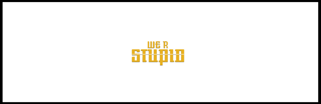
2. We R Stupid | Industry: Video Blog/ Fitness
This logo directs the viewer’s mindset to a digitally focused fitness channel. A text based logo, team Uni Square Concepts has paid special attention to the typography. The client started this business with an aim of busting the common myths that are prevalent amongst the society concerning food, fitness and lifestyle. We have elegantly carved out the name in a very proportionate manner, so as to ensure a wide digital use of the logo in the times to come. The line running parallel across the word stupid symbolises working out for a good body structure. It also highlights the fact that myths are going to be busted by us, leaving the audience no longer stupid regarding the facts concerning fitness and health. The unique way of writing the name of the organization is to represent a technology oriented environment. Read about the best free online logo makers for beginners, in our blog: THE BEST FREE ONLINE LOGO MAKERS FOR BEGINNERS.
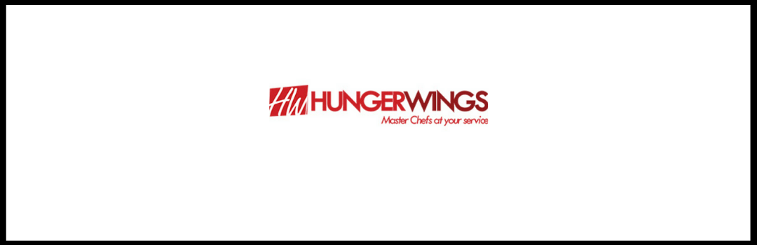
3. Hunger Wings | Industry: Hospitality (Restaurant)
Hunger Wings is a fast food chain serving its customers mostly via the home delivery and take away mode, with limited dine in facilities. The restaurant serves Chinese, Tandoori and American cuisine. The initial discussion that our team had with the client, helped us understand their target audience in a better manner. We deduced that the client required a lively and striking logo. Also deduced was the fact that the logo was to be used on several branding material, most of which would be printed. This included menu cards, t-shirts, caps, in store branding, boards, bill boards, hoardings, coasters, vehicles, etc.
After presenting several iterations, we narrowed down on the emblem of the logo. The emblem is a state of the art design, made using negative space. It does justice to the nature of business, with the colour scheme used. It makes use of the color ‘red’ in different tones. Red represents spicy and delicious food which serves as a source of attraction. To know about designing using monochromatic color schemes, read our blog: DESIGNING BY USING A MONOCHROMATIC COLOR SCHEME- A TACTICAL STEP BY STEP APPROACH. This logo design by Uni Square Concepts, cleverly makes use of the tagline ‘master chefs at your service’. The customer gets to know the nature of the organization in an effortless way.
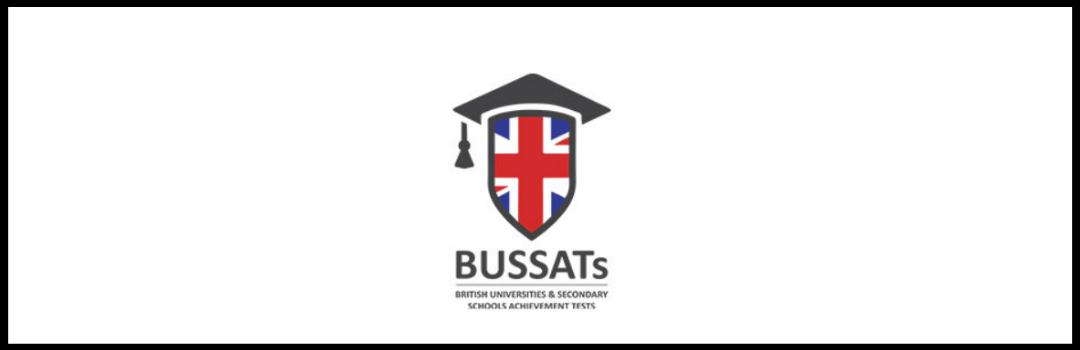
4. BUSSATs | Industry: Assessment/ Evaluation Test
Anybody can easily make out the nature of this organization at one glance. The use of ‘graduation hat’ in the logo symbolizes the educational purpose of the organization. The British flag in the center is representative of the British origin of this organization.
5. Today’s Hospitality | Industry: Hospitality
This logo vividly showcases the various purposes which are aimed at by the organization. The ‘aero plane’ and ‘dining’ icons focus on providing a good customer experience. The typography of ‘Today’s hospitality’ appeals to the viewers in an interesting way. The logo is beautifully crafted to give an elite feel to the brand, considering its nature of business and target segment. The four squares, represent the four different verticals of the business, namely hotels, restaurants, travel and events.
If you’re confused between cheap logo designs or an expensive one, read what the top agencies say, in our blog: CHEAP LOGO DESIGNS OR AN EXPENSIVE ONE? HERE’S WHAT TOP AGENCIES SAY.
6. Noida Public Sr. Sec. School | Industry: Education
This logo is very vivid and direct. One can easily understand the nature of the organization at an instant glimpse. The typography in the logo is strong and bold which enhances the credibility of the organization. The logo was designed using a 30 year old logo, originally used by the school. The two eagles depicted, are symbolic to the brand.
7. Moustache Hostel | Industry: Hospitality
One of the most iconic logos designed for a Backpacker’s Hostel, this logo wittily depicts the Indian culture by way of a Moustache (also a part of the name) and a mole. The client is running a chain of backpacker’s hostels across India, targeted to provide the modern overseas travelers, affordable boarding and lodging options. The content of the logo (Moustache hostels) tells us about the nature of the organization, which is providing accommodations. The interesting element of this logo lies in its unique typography. Using such a font makes the customer remember this organization when they’re looking for hotels. This is one of the most effective and amazing logo designs by a design company.
8. Dwivedi Associates Pvt. Ltd. | Industry: Infrastructure
The logo symbolizes multiple aspects. Dwivedi Associates Pvt. Ltd. is a company engaged in construction and infrastructure services. The house is made using tri-colors, which represent the colors of the Indian flag. This helps in depicting the association of the company with government projects. Withing the house are depicted, a compass and a D, which are the basic tools used by engineers. They together also form the initials of the name! The typography of the logo is professional and is given effects to make it look like a cemented construction, to showcase their nature of business.
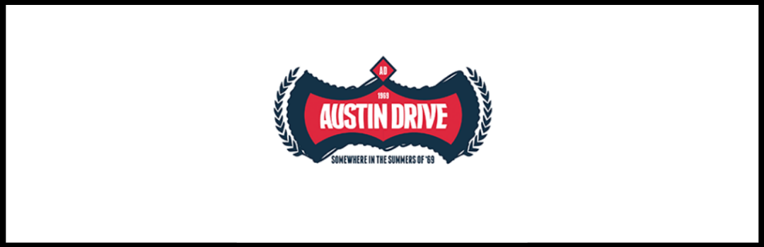
9. Austin Drive | Industry: Fashion/ Retail
The logo is intended towards giving a classic vintage feel for the brand, which deals in denims. The unique and appealing name was also suggested and crafted by the creative team of Uni Square Concepts. The power in the name, made the task of designing an equally effective logo, even more challenging. After several iterations, our team finally narrowed down on this design. The unique way of using colors in this logo points to a good sense of fashion and style. The small tagline at the bottom enhances the authenticity of the organization in the fashion industry. On having a look at the logo, majority of people would be sure of the good quality offered. Know about the top color combinations, in our blog: TOP COLOR COMBINATIONS- POWER OF COLOR RELATIONSHIPS.
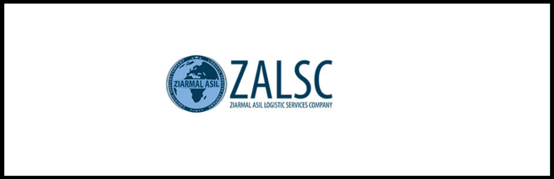
10. Ziarmal Asil Logistic Services Company | Industry: Logistics
This logo has been designed for a logistics company headquartered in Afghanistan. The company has it operations globally. The shortened form ‘ZALSC’ is a good optimization of content. Further, the presence of a globe in the logo signifies the global reach of the logistics company. This is another effective and amazing logo design by a design company. The emblem is designed to be also used independently on the various brand identity material of the client.
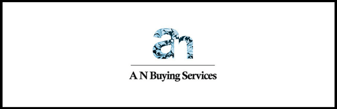
11. AN Buying Services | Industry: Buying House
AN Buying Services is a top notch export house. The logo is designed, making use of negative space. A unique pattern is overlayed on the text to reflect creativity and trends, native to the organization. The unique and attractive element of this logo lies in its typography. The emphasis placed on both the letters (‘A’ and ‘N’) is very clear and direct. The designing in the letters further adds up to the effectiveness of the overall appeal of the logo.
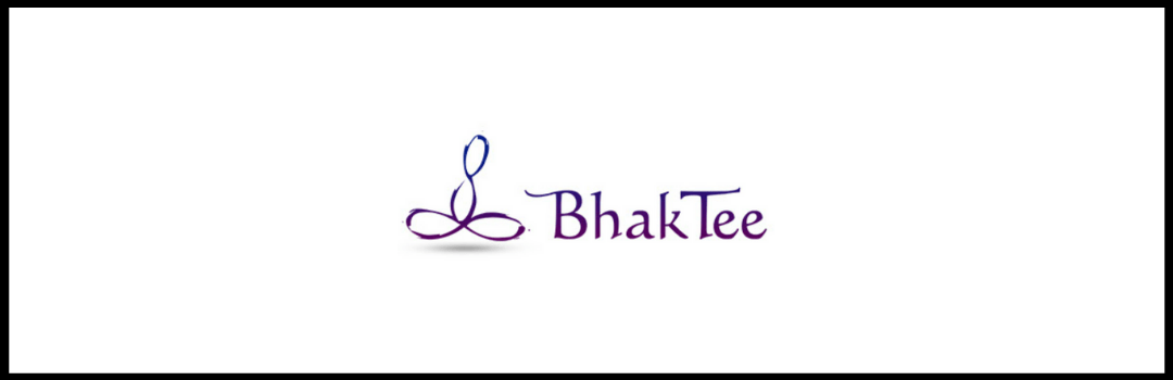
12. Bhaktee | Industry: E-Commerce/Retail
The design of this logo touches a religious element. It aims to sell products to the customers by targeting their religious side. The typography and two ‘loops’ in the logo signify the product selling nature of the organization. Learn professional logo designing for business in these 5 easy steps, in our blog: LEARN PROFESSIONAL LOGO DESIGNING FOR BUSINESS IN THESE 5 EASY STEPS.
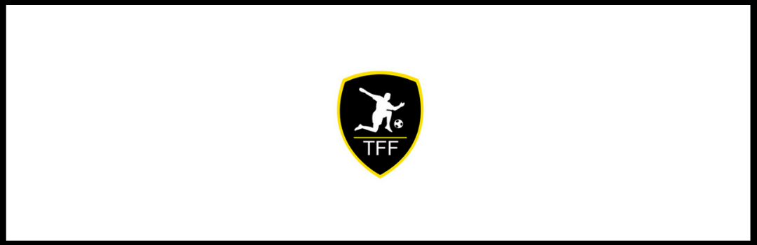
13. The Football Faktory | Industry: Sports/ Training
The name of the organization directly hints at the ‘sports related’ nature of the organization. It has been incorporated in an attractive manner by vividly making use of the ‘football’ icon. The structure of the logo content is enhancing its uniqueness. The character displayed on top of the name of the organization mark a professional and good use of graphics. This is one of the best logo design samples.
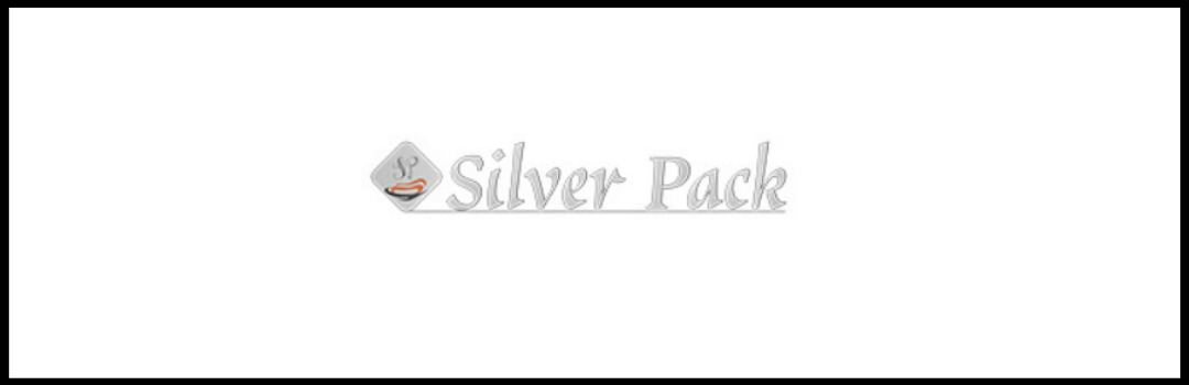
14. Silver Pack | Industry: Aluminium Foil
The color of the font in the logo is silver which points to the silver color of an aluminium foil. Anybody can easily get a rough idea regarding the organization’s product by having a look at the logo. The leftmost icon has ‘SP’ inscribed. This adds up to the significance and credibility of this organization and its product. Read about the 5 crucial logo designing tips for experts, in our blog: 5 CRUCIAL LOGO DESIGNING TIPS FOR EXPERTS.
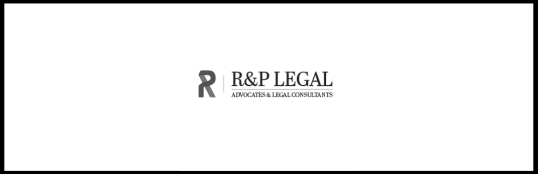
15. R&P Legal | Industry: Legal Firm
The color of this logo is black which is highlighting its relation to corporate law. The stylish way of incorporating the letter ‘R’ in the logo enhances its chances of grabbing the customer’s attention. Further, the logo’s typography is making it compelling and bold. The company can get an easy brand recall from its logo in the industry of law.
All the above points serve as the best logo design samples. You can refer to them for the designing of logos and how all the elements have been incorporated in a structured manner. Use the above effective and amazing logo designs by a design company for creating innovative logo designs.