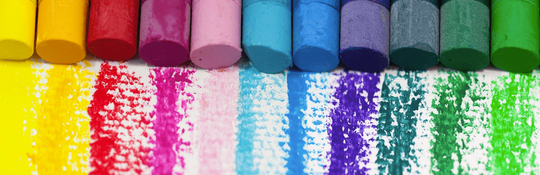
An effective blend of color combination generates an instant impact. It helps you tap natural reactions. The overall design quality enhances by using right color combinations. A random color combination can fail a good design. Therefore, going for an ideal color combination in a professional design is essential. This article presents the top color combinations, which will enable you to get the best out of colors.
One can use colors to convey messages with clarity and boldness. However, this requires being selective while picking up a color. First, let us understand the meaning of ‘best color relationships’. Color relationships are simply the relation between any two colors. For example, the contrasting relationship between black and white.
Mentioned below, are the best color relationships, which you can use to form top color combinations. You might also want to go through the following resources:
- GLOSSARY OF COLORS: CAPTIVATING COLOR COMBINATIONS
- 50 GORGEOUS COLOR SCHEMES FROM AWARD-WINNING WEBSITES
1. Complementary colors: One of the top color combinations
Complementary colors are colors, which complement one another. In simple words, they come together to enhance the beauty of a design. Complementary colors can be used to form color contrast for a professional design. They are located opposite to each other on the color wheel. When they are added together, white light is formed.
For example, blue and yellow. They form the most dramatic color contrast for professional design, out of all the color relationships. Blue and yellow add up to the excitement and energy of a design. Learn more about THE GROWING IMPORTANCE OF PROFESSIONAL DESIGNING AROUND US, before proceeding ahead.
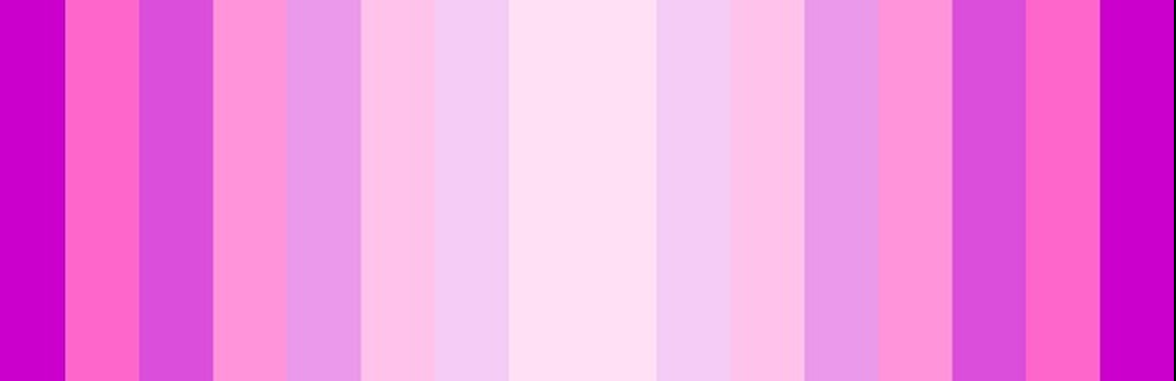
2. The top color combinations include monochromatic colors
Monochromatic colors are based on a ‘mono’ i.e., a single solid color. They are extended by varying their tones, shades and tints. The saturation and brightness of one base color is modified to get a range of monochrome colors. There is no clash of colors as the varying tones have a hint of the base color.
For example, pink, neon pink, dark pink are a part of the monochromatic range of the color pink. It helps to create a color contrast for professional design. Also, monochrome palette can be used in various innovative ways. Check out these 10 DESIGNING METHODOLOGIES FOR CREATIVE CONCEPTUALISATION OF IDEAS to generate innovative ideas.
Monochromatic colors form the best color relationships for a polished look. Hence, they are easy to use and are one of the top color combinations. Monochromatic colors are best used as gradients. Read our blog on WORKING WITH GRADIENTS: USEFUL TIPS FOR DESIGNERS and learn to make a gradient properly.
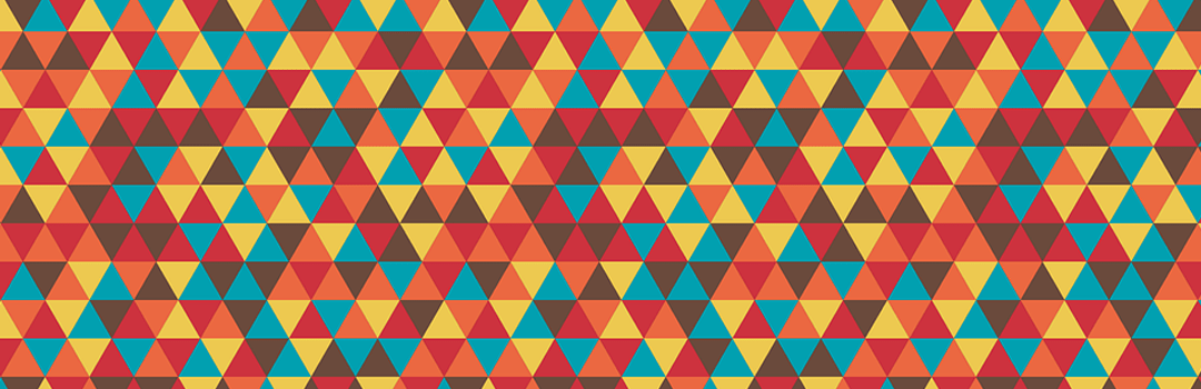
3. Retro color palette: top color combinations
Retro color palette is one of the top color combinations. It is a great way to catch up with the old colors. It includes colors like yellowish brown, off white, orange etc. Retro colors render a vintage outlook to your design. You can play with the retro palette using THE BEST FREE GRAPHIC DESIGN SOFTWARES THAT SHOULDN’T BE MISSED.
Their saturation level is low. Because of this, you should go for a strong and bold color. The hues are flat, but not as flat as pastels. Knowingly, you can form retro colors by using pastel variations of blue, red and other cream colors. This is commonly used in the graphics related to music. Retro colors form a subtle and one of the best color relationships.
4. Summer color palette
Summer color palettes includes vibrant, exciting and bold colors. For example, shades of pink, orange and yellow. These shades of the summer color palette are commonly in use. This is primarily because of their link to the summer season.
Also, bright variations of blue, pink, yellow and orange form summer colors. If you are a beginner, these colors are a safe choice. Go through the STEP WISE DESIGNING PROCESS FOR BEGINNERS: A PRODUCTIVE APPROACH to enhance your designing skills. Summer colors are commonly seen in stores, postcards and social media graphics. They are one of the top colour combinations.
5. Analogous colors
Analogous colors are colors, which are next to each other on the color wheel. They form a pleasing outlook for a design. Ensure that you use enough contrast, while selecting a analogous color scheme. Analogous colors are in groups of three. For example, green, blue and violet. Pick one primary color and then select the secondary colors.
The blue, green and yellow trio gives a refreshing and smooth look. Another example of an analogous color scheme is the yellow and reds of a sunset. These colors are aesthetically pleasing. They have rich undertones, which makes them strong colors. These colors come in use when one is designing the logo of a company. Use THE BEST FREE ONLINE LOGO MAKERS FOR BEGINNERS and try your hand at logo making.
All the above points serve as the best color relationships to create color contrast for professional design. Get a basic understanding of the main color schemes by giving the above article a quick read. Once you understand these color schemes, you’re ready to go.