Using colours in a visually engaging way is essential to achieve the prime objective of a design. A monochromatic colour scheme imparts an organised look to your design. It offers a wide variety of shades and expands your overall freedom in colouring. The practical approach for using monochromatic colour scheme effectively can be a little tricky. This article lays down a step by step approach for designing using a monochromatic colour scheme.
What is a monochromatic colour scheme? Monochromatic colour scheme is a variety of shades and tones of ‘one’ (mono) solid colour. It enables a speedy and quick incorporation of colours in the design. Further, it adds shine to the message which you wish to communicate through your design. Therefore, it plays a significant role of colour scheme in branding material. Following are the tips for designing using a monochromatic colour scheme:

1. Make an understated use of bright and intense colours
Using bright and intense colours is a bold and compelling way to convey your design. They are widely used by the companies in their designs. However, sometimes bright and intense colours just don’t fit in. They might not be appropriate for the design or may not complement the purpose of your design. In such a situation, the role of monochromatic colour scheme comes in. You can tone down such bright and intense colours and give a professional look. Thus, make an understated use of bright and intense colours using the monochromatic colour scheme.

2. Insert a colour overlay
The monochromatic colour scheme is popularly used to insert colour overlays to photographs. You must have seen photographs with varying tints like magazine covers. It works best with black and white graphics or basically a graphic having a consistent background. It enhances the overall typography by making it more visible against the background. A proper application of monochromatic colour scheme lends structure to a graphic and its layout. This is a commonly used technique of designing using a monochromatic colour scheme.
3. Section wise designing
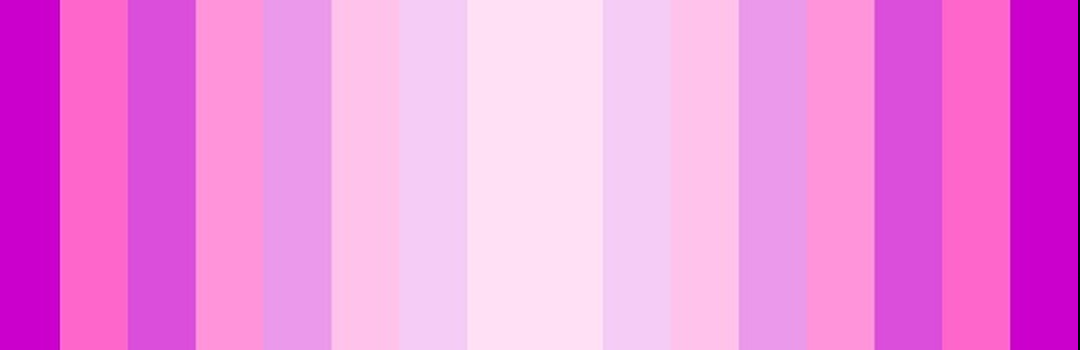
Colours can be used to divide your design into sections. They enhance the visual hierarchy of a design. Divide your design using colours by incorporating simple colours. Monochromatic colour scheme offers a wide variety of shades, tones and tints of one solid colour. One trick for a simple use of monochrome colours is to use only those number of colours which are required to separate your design elements. Maintain the aesthetic factor by minimal and creative usage of colours. This is an important tip when it comes to the role of colour schemes in branding material.

4. Two tricks of monochromatic colour scheme
First trick is to use contrasting monochromatic colour palettes. It distinguishes two elements from each other while being connected. Or you can simply opt for the complementary colour trick. Both these techniques can be used to form a connection between two products of the same brand or other related objects. The second trick is to deviate from a plain monochromatic palette. For example, you can add a little colour to your monochromatic colours to highlight certain segments of your design. In short, add an accent colour to your monochromatic colours. These are the two effective tricks for designing using a monochromatic colour scheme.

5. Go for sophisticated grayscale
Grayscale means using shades of gray for creating colour variations. A touch of gray can be used to give a sophisticated look to your design. You don’t have to necessarily stick to the plain gray. You can change its saturation and temperature. For example, come up with a cooler gray and use it in your design. Using gray with white is a commonly used colour combination. It is opted by various companies to give a professional outlook to their websites. Monochromatic colours of gray enhance the visual appeal of your design.
All the above tips form the foundation of the role of colour scheme in branding material. Implement these tips to experiment with the monochromatic colour scheme. It is the most versatile form of the colour glossary and can fit in with any possible purpose.