Typography comes up as a significant element in the process of designing. In order to successfully engage a viewer in your design, the content must be reader friendly. For correct understanding of the design elements, a designer must be aware of the basic associated professional graphic design terminology. This article presents the top five basic typography terms.
Typography terms are the professional graphic design terminology associated with the typography of a design. For example, kerning, typeface, etc. These are the essentials of design type. Hence, a correct understanding of the professional graphic design terminology is essential. This is for the smooth conduct of the process of designing. Following are the top 5 basic typography terms, the essentials of design type, that every designer must know:
1. Script typeface: A basic typography term
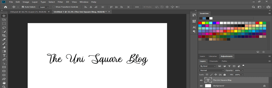
Script typeface or script font families are those typefaces which resemble handwriting. Another term for them is calligraphy. Therefore, their fluid strokes of cursive writing are an easy way to identify them. Their use is widely prevalent in digital printing. Alongside, they render a handwritten touch to your design.
One can further categorize them into formal script and casual script. Formal script roots from ancient fonts. For example, the typical fonts of 16th and 17th century. It comes in handy to convey content in fancy invitations or to make announcements. Casual script resembles ordinary handwriting. Hence, it serves informal purposes. This is a one of the significant essentials of design type.
Once through with this, also read our guide on 10 DESIGNING METHODOLOGIES FOR CREATIVE CONCEPTUALISATION OF IDEAS.
2. One of the major basic typography terms: Blackletter
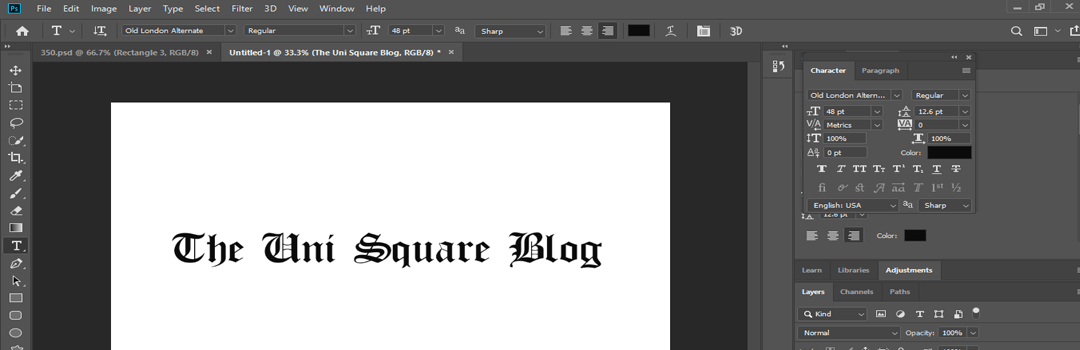
Blackletter is a typeface in graphic designing with a wide usage. It is also called Gothic script, Gothic minuscule and Textura in professional graphic design terminology. You can identify it by the varying thin and thick strokes. It focuses on enhancing the readability and legibility of the content in a design. Most of the times, it isn’t incorporated into the main body of the design. As it is famous for arresting the viewer’s attention at a glimpse. Therefore, blackletter is used to write the headlines and other relevant information, which needs to be highlighted. Two common Blackletter fonts are Cloister black and Germanica.
Blackletter will make your work polished and professional. Keeping in mind the GROWING NEED OF PROFESSIONAL DESIGNING AROUND US, it is a useful typeface.
3. X height and cap height
X height refers to the height of lowercase letters. It specifically targets the letter ‘x’. It excludes the ascenders and descenders. Ascenders are the part of ‘x’ letter which extend over the ‘x’ height. Whereas descenders are the part of ‘x’ letter which extend below the baseline.
Cap height refers to the height of a capital letter. It is easy to measure the cap height of straight letters like E, L, I, etc. On the other hand, it is difficult to measure the cap height of curved letters like O, U, etc.
X height and cap height are one of the important basic typography terms.
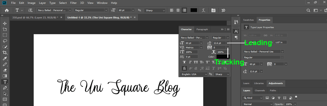
4. Leading and tracking
Leading refers to the distance between the baselines of the content. Baselines are the actual lines on which the characters rest. Therefore, correct leading is essential to ensure the readability and legibility of your graphic design. It is one of the essentials of design type. Above all, avoid narrow baselines. However, the baselines shouldn’t be too far either.
Tracking refers to spacing between simple letters. It makes uniform adjustments consistently over the entire content and not particularly on specific words. It seems to hold a minute significance. However, it plays an essential role in enhancing the aesthetic appearance of the typeface. Moreover, it adds up to the overall legibility. Check out our blog for the TOP 10 DESIGNING PRINCIPLES: UNDERSTAND THE DYNAMICS BEHIND DESIGN AESTHETICS.
Leading and tracking are two relevant basic typography terms.
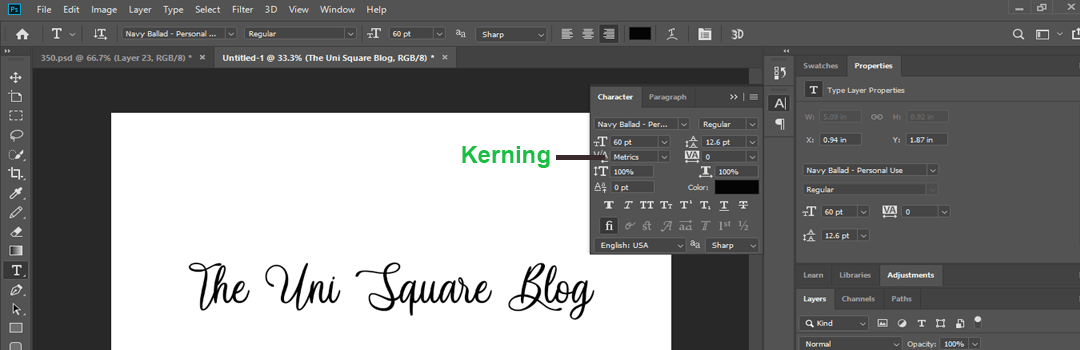
5. Kerning: A basic typography term
Kerning is the process of correctly spacing the letters. It works on the spacing of individual letters. In simple words, you can incorporate varying spaces between different letters in the graphic design. With certain typefaces, inconsistently spacing the letters is necessary. Kerning is used to generate an aesthetic appearance of the design.
Tracking is consistently spacing all the letters in a content. Kerning is case by case, individual spacing between the letters. It is one of the most relevant professional graphic design terminology.
After reading this blog, you must have got a fair understanding of the typography basics. All the above points elaborate the basic typography terms. One should be aware of the essentials of design type, in order to get the best professional designs. In fact, if you are looking for some professional inspiration, click here.