A good color evokes a positive reaction in the viewer. It is incredibly important to understand the meaning of every color before incorporating it. This forms a solid foundation for the process of coloring. From the designing perspective, only a few colors are relevant which are listed in the following color glossary. This article lays down a glossary of colors, which aims to provide an understanding of various color schemes.
We generally have a huge number of colors to choose from, while designing. However, the real trick lies in the correct incorporation of the numerous color combinations. You may have picked up an ideal color scheme. But, its effectiveness solely depends upon your understanding of the particular colors. Following are the points that will help you to know about the professional color combinations for practical design:
1. Glossary of colors: The neutral color family
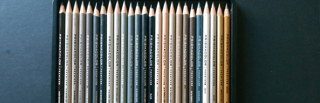
The neutral color family includes the natural tone colors like black, brown, grey, beige, etc. They are suitable for natural, earthy or organic content. For example, if an article or blog is related to the topic of environment, you can use the neutral color family. They have a glossary of colors, shades, tints and tones. You can simply pick up a suitable color from the neutral color family. Thereafter, adjust its brightness level to experiment with its various tones.
One of the effective tips is to increase the transparency level of your neutral color or bring down the saturation level. This will enhance the overall earthy element of your design. It is widely used and provides effective color combination for advertising design. If you are new to the field of designing, view the STEP WISE DESIGNING PROCESS FOR BEGINNERS: A PRODUCTIVE APPROACH.

2. Glossary of colors: The neon color family
Neon colors are glowing colors. A warmer shade of the pink color gives you neon pink. Similarly, every other color can have a neon shade. They are bright, vivid and can be used to grab the viewer’s eye. They are tough to incorporate as they shouldn’t cause any kind of damage to your design. An expert tip is to contrast the neon color with a dark background. This will enhance the overall legibility of your design, while adding up to its vibrancy. It is extremely essential to use effective color combinations for advertising design.
Another tip can be to incorporate the neon colors in your font. However, in this case, ensure that you’ve a dark background. Appropriate insertion of the neon color, without harming the other design elements, is one of the easiest modes of capturing the viewer’s eye. You need to be careful with your ideas while using neon colors. Check out our blog if you need help generating ideas: 10 DESIGNING METHODOLOGIES FOR CREATIVE CONCEPTUALISATION OF IDEAS. Neon color family is the most trendy color combination in the glossary of colors.

3. Glossary of colors: The pastel color family
Pastel colors are the soothing and milky colors like mauve and baby blue. They provide a very calm and soft outlook to your design. They have low to medium level of saturation. Soft colors are always in demand. They render a soothing compliment to your design and enhance its overall elegance. It is hard to achieve contrast while using pastel colors. Therefore, it is important to learn professional color combinations for practical designs. Usually, one pairs white color with the pastel colors for complimenting them.
An effective tip is to incorporate the pastel color in your fonts. They will render a unique and attractive edge to your typography. The pastel color family is widely looked up in the glossary of colors. Effective color combinations are required for every designing work. From logo making to making a brochure, etc. To know more about logo making, read our blog: 5 CRUCIAL LOGO DESIGNING TIPS FOR EXPERTS.
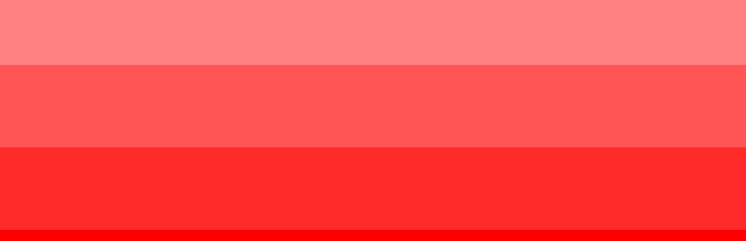
4. Glossary of colors: The monochrome color family
Varying the tones of one single color can form monochrome colors. To do so, choose a solid color and its shades, tints and tones. Subsequently, modify them to get a monochromatic color scheme. They have a wide usage in the modern day world. A monochromatic color adds up to your level of freedom while coloring. It provides numerous shades to you.
The overall flat and dull effect can be reduced using monochrome colors. You can incorporate monochromatic color scheme in your background. Another useful tip is to go with the ‘given color’. For example, if purpose behind designing gives you a certain color, you can experiment by varying the tones of that particular color. You can use these tones to form an effective color combination for advertising design. Monochrome gives a professional finishing to your work. Here are the TOP 10 DESIGNING PRINCIPLES: UNDERSTAND THE DYNAMICS BEHIND DESIGN AESTHETICS.
All the above points can be used to get a basic understanding of the color families belonging to the glossary of colors. Learn professional color combinations for practical designs and pick the right color family which compliments your designing objective. Incorporate the same while keeping their meaning in mind.