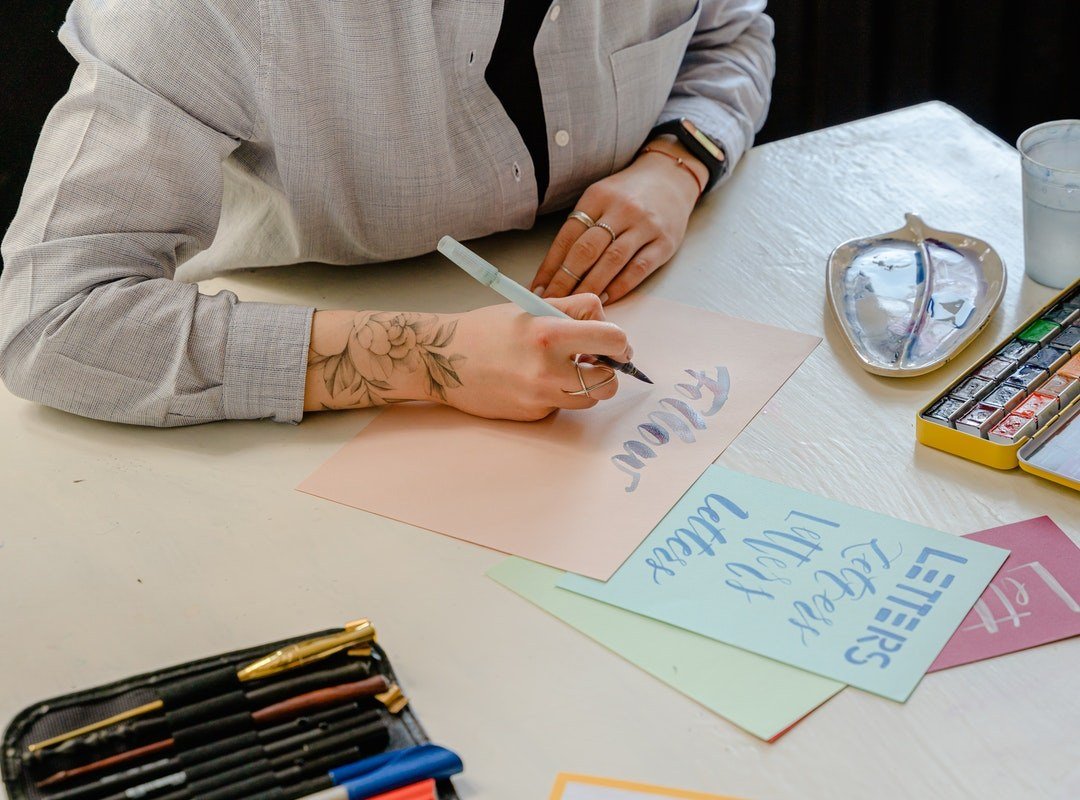
Relevant content presented in an appealing way, forms an attractive design. Similarly, if you present high quality content in a poor way, it will deteriorate the design’s appeal. Typography requires creative input, equal to all other design elements. Therefore, a series of steps must be taken to learn professional typography. This article presents a simple approach to learn ‘how to work with kerning in typography’.
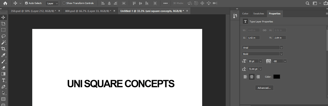
So, what is kerning? Kerning is basically concerned with adjusting the spacing between various characters. It varies over different segments of the text. You should have a basic understanding of ‘what is kerning’ and the tricks behind it, to learn professional typography. Following are the simple and effective tips for ‘how to work with kerning in typography’:
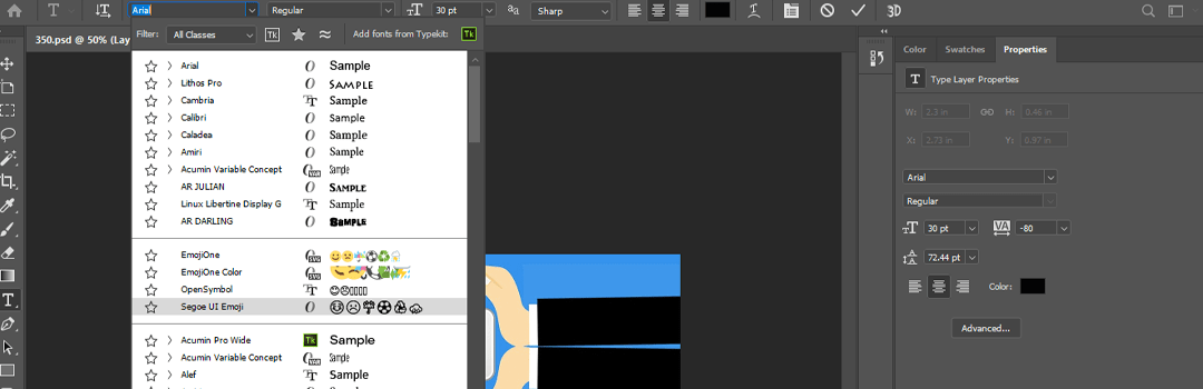
1. How to work with kerning in typography? Choose your fonts wisely
Understand the basics of every font. This is important to obtain a proper know how of their height, width and other dimensions. Also, depending upon the kind of font chosen by you, the negative space will also vary. Letters with slanted sides have a lot of negative space. Each font will have a different spatial relationship for its letters. Therefore, choose an ideal font after learning what is kerning and working with it.
Read about other related topics on: 10 DESIGNING METHODOLOGIES FOR CREATIVE CONCEPTUALISATION OF IDEAS.
2. Kern optimally
Excessive kerning can make the text difficult to be read. You’ve to take a decision depending upon the visual appeal of the content. You can go for varying the space between different letters. Or, you can make the space volume equal between all the letters. Although, it is better to kern a little than to kern excessively. However, always aim at optimal kerning. This is one of the essential points in the process of ‘how to work with kerning in typography’.
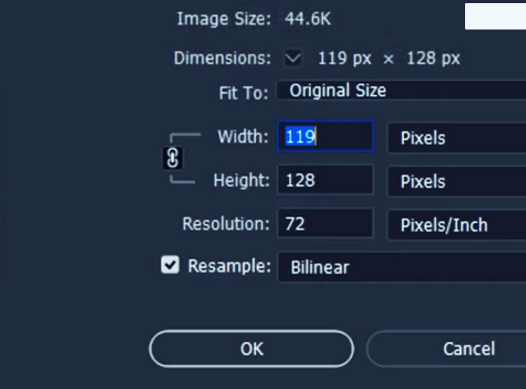
3. Fix leading and tracking before kerning
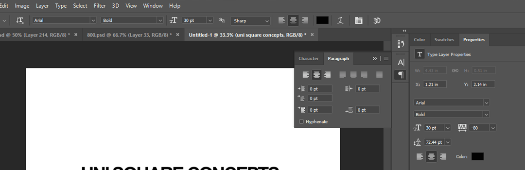
Tracking is the overall spacing between letters whereas leading is the vertical spacing between the lines of type. Kerning is the spacing between individual letters. You should make the necessary adjustments of tracking and leading, before beginning the process of designing and kerning. All these aspects affect the ‘spacing element’ of any design as a whole. This is one of the technical aspects, which one must know to learn professional typography.
4. How to work with kerning in typography? Ensure adequate spacing
Kerning is all about spacing and giving a neat and organized look to your design. Letter spacing is important, but one can’t neglect word spacing. Avoid making the words stick together. They should have enough space between them, such that they’re legible enough to be read. Spacing is important in making your design appealing. Read the TOP 10 DESIGNING PRINCIPLES: UNDERSTAND THE DYNAMICS BEHIND DESIGN AESTHETICS.
Pay special attention to diagonal sided letters as they’ve the maximum amount of negative space. Provide adequate spacing between letters and words to achieve the goal of good kerning. Spacing plays the prime role in the process of ‘how to work with kerning in typography’.

5. How to work with kerning in typography? Kern individually or in groups of three
You should put focus on each letter individually for the best results. Understand all the aspects related to each letter and kern it accordingly. Or, you can take up letters in groups of three rather than single words. If you look at words as whole, there’s a high probability to miss out on the details. Kern a trio accordingly.
These days, everybody looks for a shortcut. However, it is essential to take an extra effort to obtain a successful and unique design. You have to focus exclusively to achieve good results in the process of ‘how to work with kerning in typography’.
All the above points serve as the basic tips, which can be used to learn professional typography and master the artistic skills required. Effective kerning is essential to learn professional typography. It will help you further in professional designing. To further improve your design skills, it is vital to know the importance of designing. Know more about THE GROWING IMPORTANCE OF PROFESSIONAL DESIGNING AROUND US. Now that you know what is kerning, incorporate it while keeping the above minute details in mind.