A colour forms the reflection for your design. It generates an automatic emotional response in the mind of the viewer. Vibrant and bright colours are one of the most widely used colours in designing. They can be easily used to grab the viewer’s attention. However, you must incorporate the bright colours in a professional and sophisticated manner. Following a guide for proper usage of neon collars is a must. This article presents the correct ways for the use of neon colours in branding material.
There are numerous ways of incorporating a neon colour. You can fill it anywhere in the canvas. But where is it the most effective? Use of neon colours in branding material is surely an effective way to capture the viewer’s attention. However, this must be coupled with a professional usage. Following are the tips for how to make a professional graphic design while using bright colours.
1. An unexpected usage
Everybody uses bright colours in the most obvious way. For example, if we have a banana, we will make use of bright yellow to paint its outside. This is a conventional approach to usage of neon colours. You can flip this concept by making a non conventional use of colours. You can change the bright yellow outside of the banana to grey. Use the bright yellow on its head or some other part. This is a simple and effective trick for the use of neon colours in branding material, to catch the viewer’s attention. It will surely make the bright yellow pop up in the banana. Read our blog FUNDAMENTALS OF GRAPHIC DESIGNING- CAPTURE CUSTOMERS EFFORTLESSLY to know more about interesting graphic designing techniques.
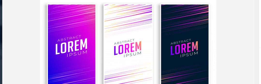
2. Play with the temperature
Manipulate the colour temperature of the neon colours. You can create a transition from ‘hot’ to ‘cool’. Begin by introducing an intense and hot tone of the bright colour and show its transition slowly. This is an effective way of incorporating a bright colour. This is simply because manipulating temperature in the right way develops a flow in your design. For example, you can vary the temperature of a bright colour in a landscape. It will develop a natural flow in the viewer’s mind as he drifts from the cooler tone to a more intense tone. Try using more of warmer colours as they render an intense outlook to your design. This is another eye catching trick for using bright colours in design. Take a look at our blog 7 CAPTIVATING GRAPHIC DESIGN PORTFOLIOS THAT WILL AMAZE YOU to know more about creative graphic designs.

3. Bright backgrounds
One of the most simple use of neon colours in branding material is using it in the background. Using bright colors in a design is easy. You can take a solid tone of a bright colour and insert it in the background. Make the background tone match with the typography and other design elements. For example, if you’re using bright yellow, then ensure the font colour isn’t light. In simple words, pick a solid colour for your background such that the legibility of your design is enhanced.

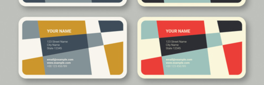
4. Bright colours as primary colours
Using bright colours in a design as primary colours is concerned with using them as the main colours of the design. For example, you can use three bright colours like red, yellow and blue together. This will give an equal limelight to all three colours. The first benefit of this composition is the use of three primary colours. They all are equidistant on the colour spectrum. You can use other colours also, which are equidistant on the colour spectrum. This is a professional approach for using bright colours in a design. Learn more about the right color schemes in our blog GLOSSARY OF COLORS: CAPTIVATING COLOR COMBINATIONS.
5. Exploring colour relationships
Explore the relationships between the neutral and bright colours. For example, if there’s already an existing bright colour in the design, an unexpected addition of colour adds up the excitement. Using bright colours in a design is possible by combining them with dark colours. The bright colour would obviously pop up. This is basically exploring the relationships between bright colours and neutral colours. Using bright saturated tones with neutral tones for use of neon colours in branding material is a constructive usage of bright colours.
All the above points serve as effective and constructive ways for the use of neon colours in branding material. They summarize a simplistic approach to ‘how to make a professional graphic design, while using bright colours’. Go for a correct incorporation of neon colours to get the best results in designing.


I love your blog.. very nice colors & theme. Did you create this website yourself or
did you hire someone to do it for you? Plz answer back as I’m looking
to construct my own blog and would like to know where u got this from.
appreciate it
Hello! We have constructed this blog on our own. Uni Square Concepts is an advertising agency and has such competencies, in house. You can visit our company website http://www.unisquareconcepts.com for more details.