Conference Banners and backdrops are used to communicate information about an event. The communication element of a banner is dependent upon its design as it provides a basic outline of the event’s theme. This article highlights the top ten points, which you ought to know as a professional designer while designing a conference banner.
A conference banner should convey a professional feeling to the viewers and should have an attractive visual outline. It must be kept in mind that the elements of a banner must add up to its visibility. Here are the ways of designing a conference backdrop:

1. Opt for a proportionate canvas size
In a situation, where you aren’t able to get the desired aspect ratio while designing, go for the right proportionate canvas size. An aspect ratio is defined as the relationship between height and width of your canvas. Keep the desired aspect ratio in your mind then ascertain the proportionate ratio accordingly.
For example, if you want your conference banner to be 30 by 10 inches, then go for a proportionate aspect ratio of 3 by 1 inches. The printer can then scale up the canvas size according to the actual dimensions. Using vector images in the design would ensure that the print does not get pixelated. Therefore, create the banner in a smaller and proportionate size and get it enlarged later.
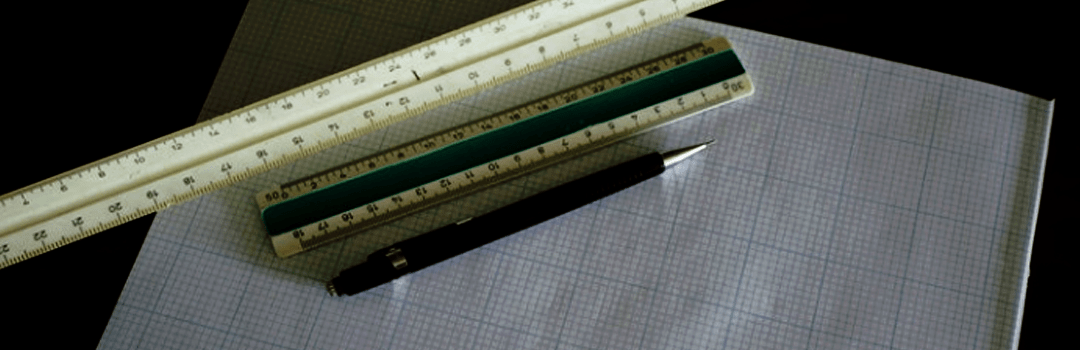
2. Design should be in a vector format
A vector format or an EPS file of an image is based upon a mathematical formula. It ensures that the same level of sharpness exists in all the sizes of the banner. It offers flexibility to modify the size as per requirements.
The vector files can either be created or can even be downloaded online. There are various websites, which provide designs in vector format. These include, Vexels, BrandEPS, Vector4Free etc. You can modify the various vector designs according to your needs.
![]()
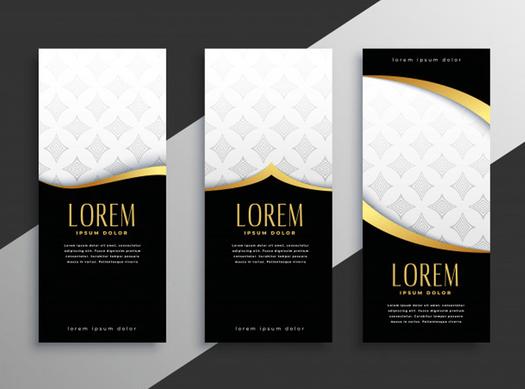
3. Appropriate placement of logo
The logo should be one of the first things, which a customer looks at in the banner. The traditional approach of placing the logo on the top left corner of the banner can be followed in case of doubts. Ensure that it doesn’t overshadow the content written in the banner. The logo can also be placed near the company’s name while designing the conference banner. This is one of the technical aspects of an event backdrop, that has to be considered at any cost.

4. Use the right fonts and colours
Choose a font style and colour for your conference banner, which has an easy readability. You should pick fonts, which are easier to view from a distance. For example, the Sans Serif font styles like Helvetica, Futura etc. are a good choice. You can also make use of a mix of uppercase and lowercase letters.
Do not stick to only big and capital letters as they pose difficulty in reading for the target audience. The colour combination should display a high contrast, between the text and the background. Red and yellow, black and white, yellow and brown etc. go well together.
5. Develop symmetry
Symmetry involves creating a balanced and similar arrangement on both sides of the design of the conference banner. The human brain is said to be attracted to symmetry. Effective symmetry adds to the visual stability of the conference banner. There are various forms of symmetry, which you can use. These include rotational symmetry, reflection symmetry, translational symmetry, etc. Business organisations that are built upon stability and a strong structure tend to use symmetry in designing. However, in order to stand out, you can also use the concept of asymmetry. Symmetry and asymmetry mark the technical aspects of an event backdrop.

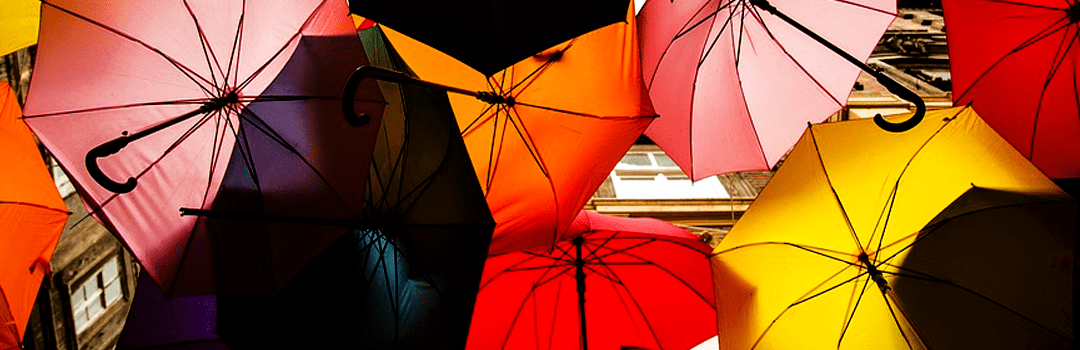
6. Use the power of contrast
Contrast is a property of a picture, which distinguishes the main focus area from its background. There are various forms of contrasts like colour contrast, size contrast, shape contrast, positional contrast etc. Using bright and vibrant images on a dull background is an example of colour contrast. Using different sizes of letters is an example of size contrast. Adding varying textures to the design can add to the contrast element of your conference banner.
7. Use high resolution and vivid images
The audience prefers images over text. Use meaningful and interesting images to convey information to the target audience. The images should be of high resolution. Preferably use the photographs shot professionally. One of the most innovative techniques to use images is to put images in the background. Give a hint of your organisation’s working, using background images. The images used, should compliment the information in the conference banner.

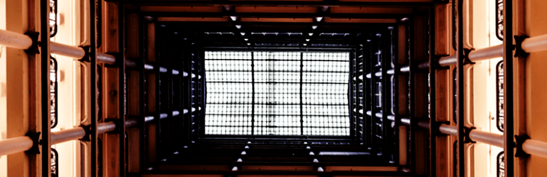
8. Use Grid while designing the banner
Using grids while designing provides a better understanding of the lines and shapes. It reduces the overall time required in the entire process of designing a conference banner. You can perfectly position all the elements and provide an adequate balance to them. Moreover, it is an effective way to overcome the cluttered outlook by opting for a systematic approach.

9. Develop Hero banners
Hero banners are conference banners that make use of a hero image. The hero image is the first thing to be noticed in the banner. It acts as the center of attraction of your design. Experiment with the image using various effects. Modify it in terms of saturation, tone, contrast, temperature etc. Use colour contrast in your hero banner and go bold with your fonts and colour choices.

10. Use check marks over standard bullets
Don’t go for the conventional approach of writing the points using standard bullets. Use a checkmark or an arrow. You can also develop custom made bullets for presenting the information in the banner. For example, in adobe illustrator, you can add graphics to the bullets. This is an innovative way of presenting information in your conference banner.
These are the basic things to keep in mind while following the procedure of designing a conference backdrop. Keep them in your mind in order to design a captivating conference banner. Your banner should be able to speak for itself and persuade the viewers to contact you.